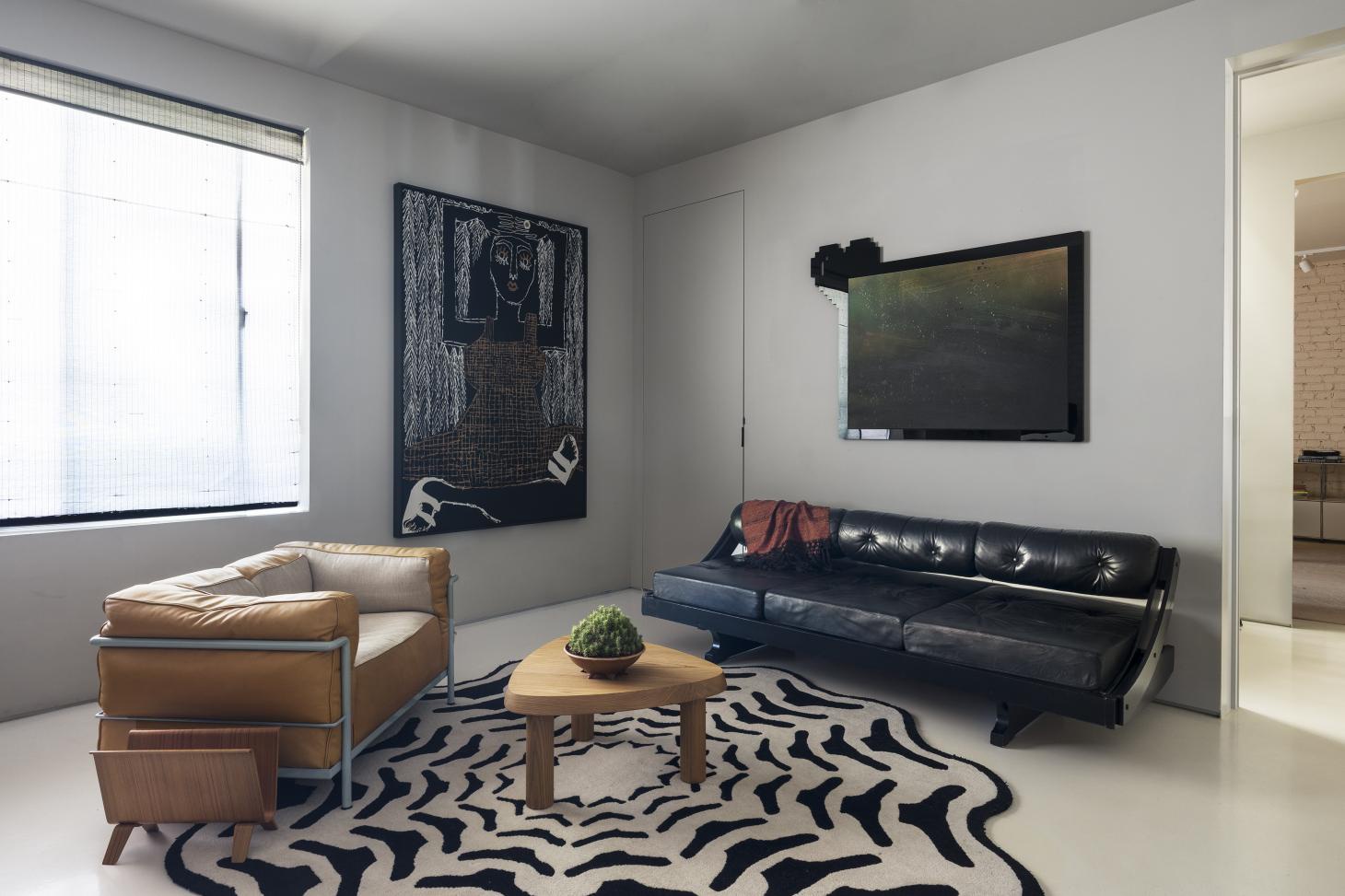
The new Shulamit Nazarian Gallery space in Los Angeles by Studio Shamshiri combines party fun and domestic comfort
Part party pad, part cosy home, a newly redesigned space at Shulamit Nazarian Gallery in Los Angeles by Studio Shamshiri bridges eras and functions. But beyond being a beautifully balanced workspace, a hub for culture and a true LA arts crowd haunt, this is a space born out of a seamless collaboration and a long-standing friendship – a strong recipe for success. Gallery founder Shulamit Nazarian and Pamela Shamshiri met through their mutual friend, Wallpaper* US director Michael Reynolds seven years ago, and synergy flowed. ‘We had lunch together and it was instant love,’ recalls Nazarian.
The commission for this new space, an extended display area with an office and meeting room, came much more recently, after Shamshiri worked on the gallerist’s own home, and following Nazarian’s purchase of her Hollywood art base, which opened in 2017. This property’s second floor, the location of this project, was originally a private appartment, a relatively open-plan space featuring two bedrooms and three bathrooms. Nazarian wanted to reimagine it as an extension to her downstairs gallery – but also as a space with a distinct identity. She called upon Shamshiri.
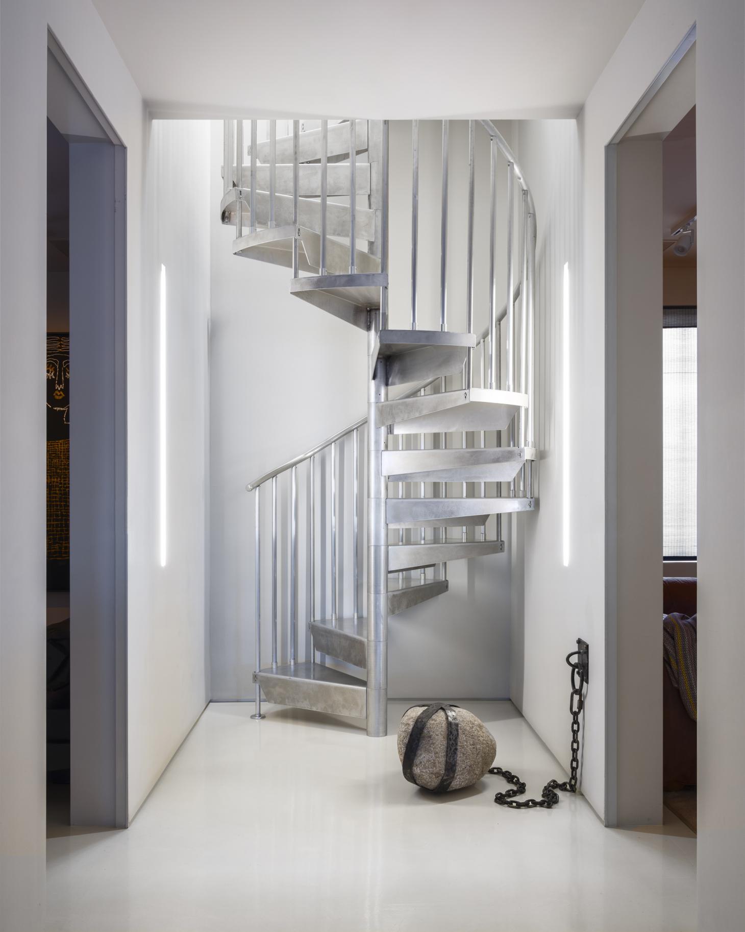
The metal staircase leading to the roof terrace, alongside FAay Ray’s Guardian (2020). Image credit: Ed Mumford
‘We had big imaginations at the beginning. But then we simplified,’ says Nazarian, whose background in design and architecture was a catalyst in this dynamic collaboration. The LA gallery scene of the 1950s and early 1960s was a key source of inspiration for the pair, who wanted to infuse the new space with the comfort of a domestic home, a cosy interior that makes everyone feel welcome, and the glamour and unexpected fun of an impromptu party.
‘[Much of the inspiration came from] the idea of this legendary party, and its afterparty upstairs,’ says Shamshiri. So the team decided to eliminate one of the bathrooms and use the room for a staircase that leads up to the roof terrace, which opened up a world of opportunities in terms of its use. ‘It brings the element of surprise, transporting you to a different world,’ Shamshiri explains.

Eames Management Chairs and Mantis BS3 Table Lamps set against a custom desk and the AG1 Carpet by Anna Gili.
On the wall is Maria A. Guzman Carpon’s Entre Nube, 2020. Image credit: Ed Mumford
The interior is a careful composition of warmth and roughness, matching contemporary product design with exposed brick walls, painted masonry, and smooth, almost industrial-feeling resin floors. A series of front window boxes opens up in the same way the shutters at Le Corbusier’s famous Cabanon worked – easily and efficiently changing the views according to their orientation. Of course, the end result’s seeming effortlessness didn’t come without its challenges. ‘The staircase was one of them,’ Shamshiri says. ‘It was technically, and code-wise challenging; it moved a few times. But now it has this energy, it draws you up.’
Bespoke pieces sit next to vintage finds and of course, plenty of art, making this space at once luxurious but also very grounded. There is a denim sofa, the ‘Jofa’ by Wendy White, which was specifically done as a collaboration between Studio Shamshiri and the artist, as well as art pieces by Coady Brown, Michael Stamm, Bridget Mullen and Fay Ray. It all comes together in an interior that feels functional and flexible, yet still playful and transportive.
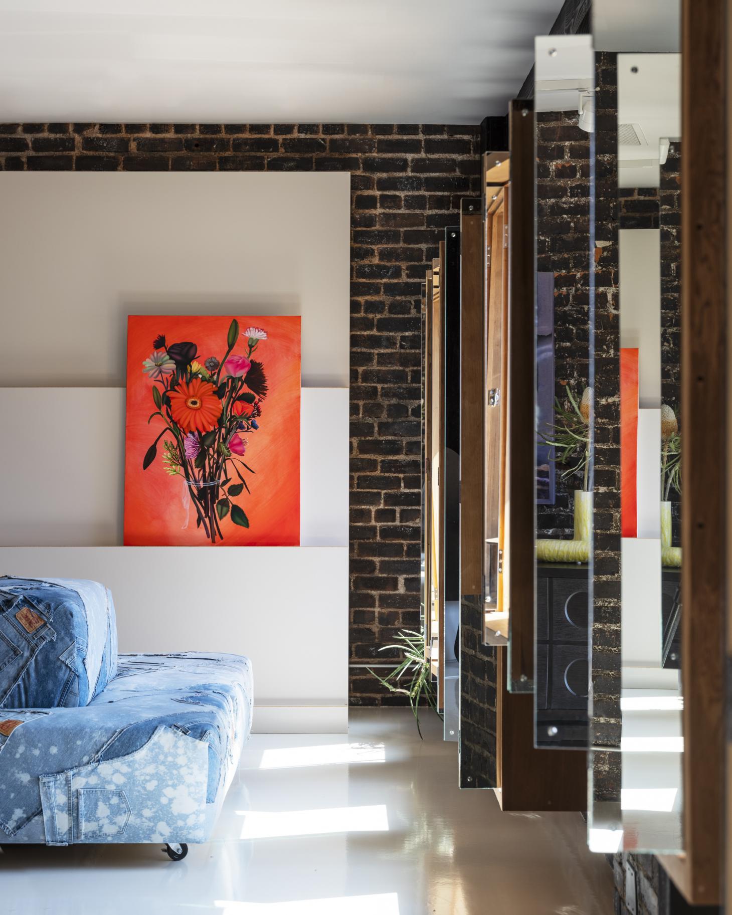
The ‘Jofa’ by Wendy White seen next to Bouquet #10 (for things that are certain but have yet to come) (2022) by Coady Brown. Image credit: Ed Mumford
Ultimately, Nazarian concludes, the space was meant to bring together like-minded people. ‘[We wanted it to] be like a think tank, for people who like art, to entertain, to host all aspects that art and design connections, where people can communicate, exchange ideas and get inspired. It’s functional, but also a space where you can just relax. Put your hair down and sit back and enjoy.’
It is exactly this spirit of experimentation, avant-garde creation and pure fun that Shamshiri drew on for her design. ‘Frank Gehry’s deconstructivist era also inspired us, as it was about art, and there was a freedom. Los Angeles felt like a playground. Our focus is not to have it feel too “design”. It started as an afterparty place, and it became more serious, while keeping its sense of playfulness.’

A Piet Hein Eek ‘Canteen’ table in scrapwood surrounded by walnut-toned Vico Magistretti-inspired stacking chairs populate a meeting area.
ON THE WALL, ANNIE LAPIN’S WATERSHED, 2020. IMAGE CREDIT: ED MUMFORD
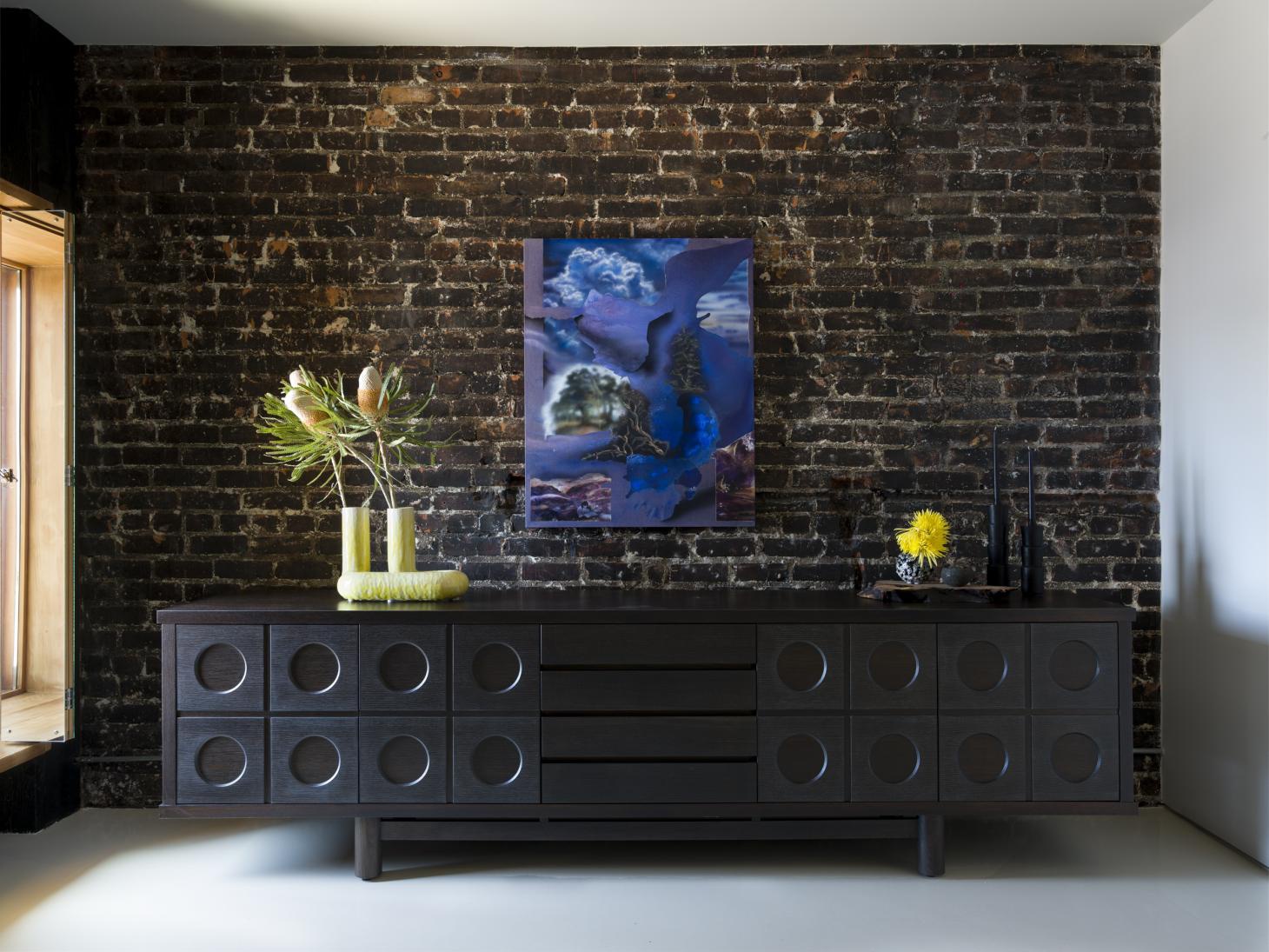
A custom brutalist buffet by Mano Ya, decorated with an Alex Reed ‘XL Double Vase’ in yellow, a Raina Lee Ceramics ‘Black White Lichen Globe Vase’ and Arno Declercq ‘Tower Duo’ candle holders.
ON THE WALL, ANNIE LAPIN’S WATERSHED, 2020. IMAGE CREDIT: ED MUMFORD
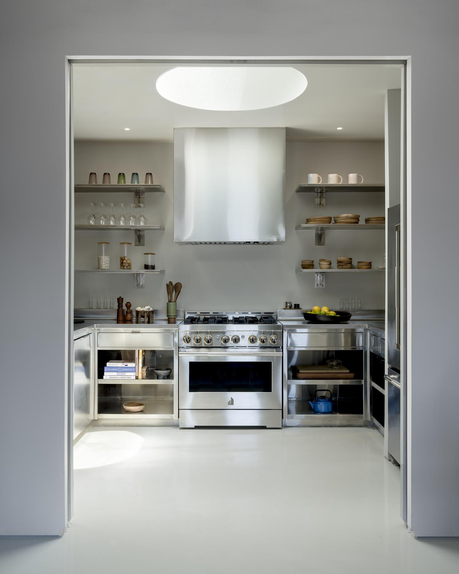
The new space’s Inox kitchen. Image credit: Ed Mumford
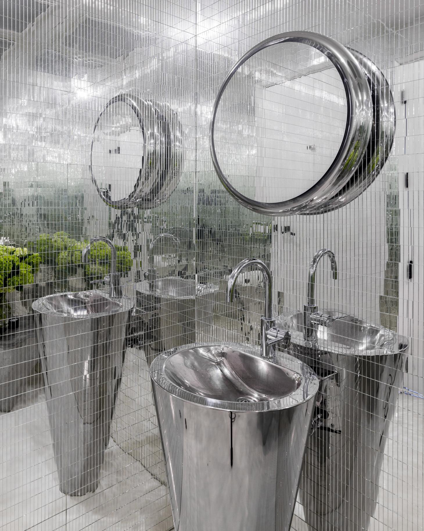
The bathroom features an Agape ‘Solid Mirror’, a Neo Metro ‘Mira’ high polished stainless steel vanity and a Dornbracht single lever lavatory mixer tap. Image credit: Ed Mumford
